-
Farmer’s Market is beloved Baltimore tradition, a community arts event featuring over 50 vendors and live music.
For the primary flyer I created a custom illustration that tells the story of the event’s legacy and the space it's hosted in. I completed the brand package by choosing blockier, retro fonts that mimic a video game menu.
-
Working with a team of theatre educators and the St. Paul's Communications department, I storyboarded initial ideas with a focus group based off of their frustration with previous methods of show promotion. In earlier years, promotions were too scattered and confusing for audiences to engage with in a collected format. There was a need for a graphic with a more cohesive appearance, while still maintaining the individuality of each show.
Using a unified color palette with simplistic, yet bold graphics, I was able to present a deliverable that not only solved their branding problem, but could serve as a template for years to come.
-
Farmer’s Market is beloved Baltimore tradition, a community arts event featuring over 50 vendors and live music.
The primary flyer uses graffiti imagery, color inversions, and filtered noise to create a collaged feel synonymous with this DIY space. Legibility was prioritized in the secondary flyer, maintaining the original aesthetic while opting for a subdued background with a reduced opacity, and a subtle border to organize the information.
-
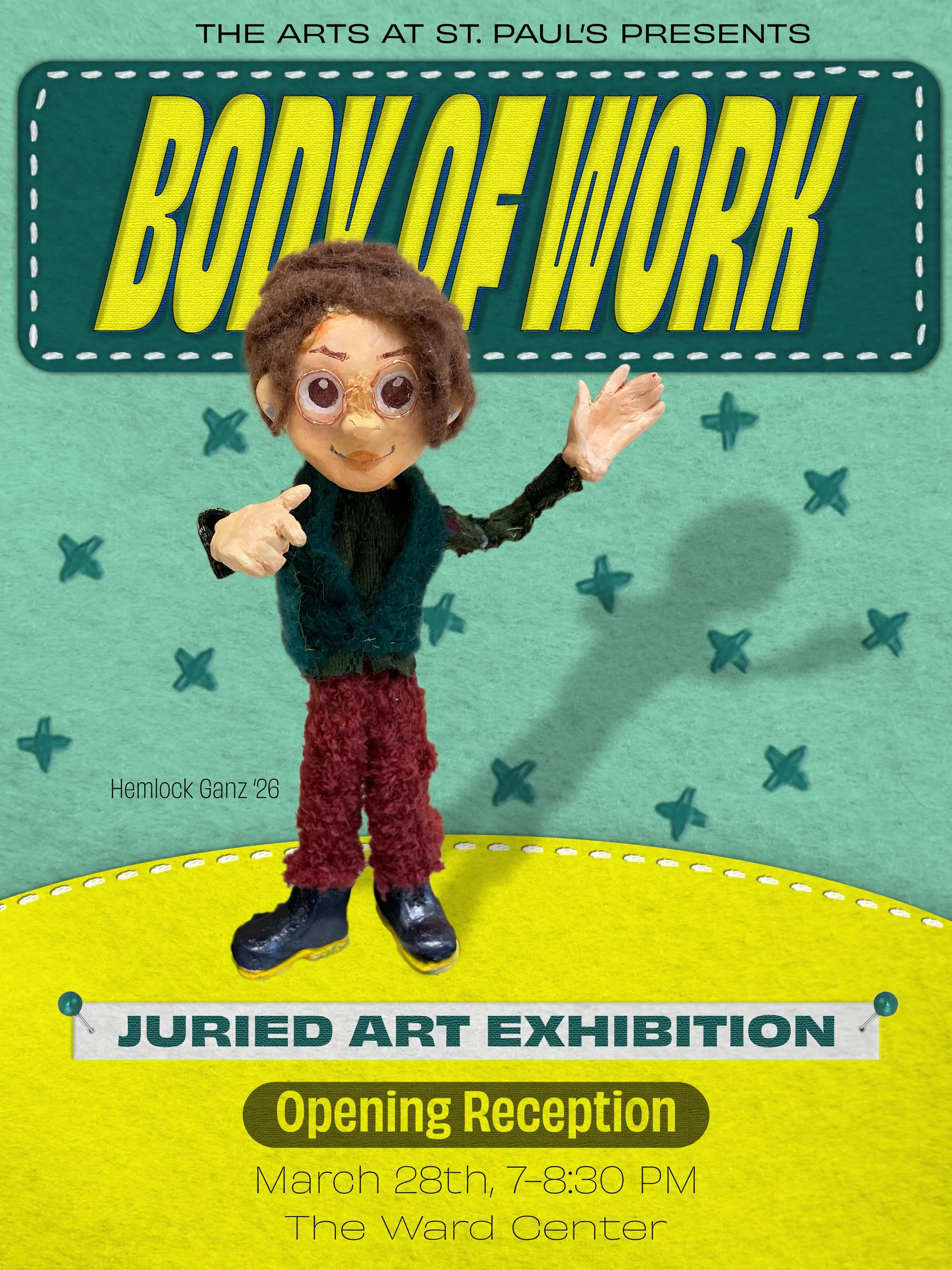
The St. Paul’s Schools Body Of Work Exhibition is the culminating night for public facing artwork. These flyers were created for both print and web distribution, embracing the qualities found within the student artwork visual assets as springboards for the design motif.
-
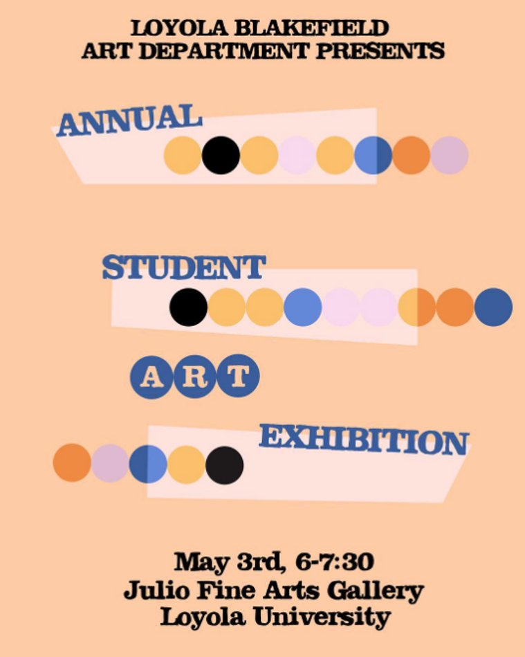
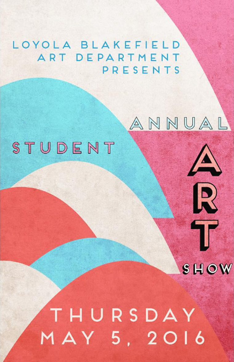
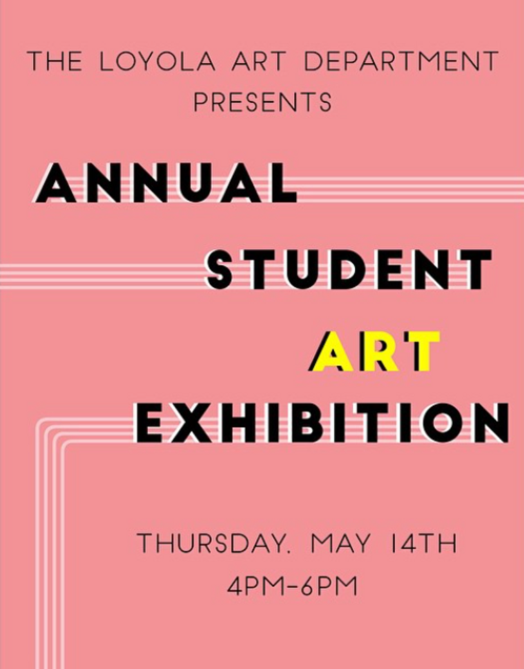
Loyola Blakefield’s Annual Student Art Exhibition is the culminating event for public-facing artwork, installed at the Julio Fine Arts Gallery.
Featured are select designs that were used for both print and web distribution.
-
Prior to creating the final flyer for the event, I wanted the "Call for Artists" event material to have a more welcoming feel. Working with a soft pastel palette, I utilized imagery from the previous year's event as well as subtle visual callbacks to skatepark building to create this design.
-
On behalf of Tuxis Giant, NYC alternative band that’s sometimes quiet and sometimes loud, I created this flyer for event print and web distribution.
This design began with a long-exposure photograph I made while traveling with Tuxis Giant’s songwriter. I leaned into the analogue feel of the image through added noise and halftone filters. The choice of a clean serif font with a slight gradient creates a contrast that explores contemporary design trends within a timeless aesthetic, much like the band’s music.